
Pudukkottai & Trichy
What We Offer
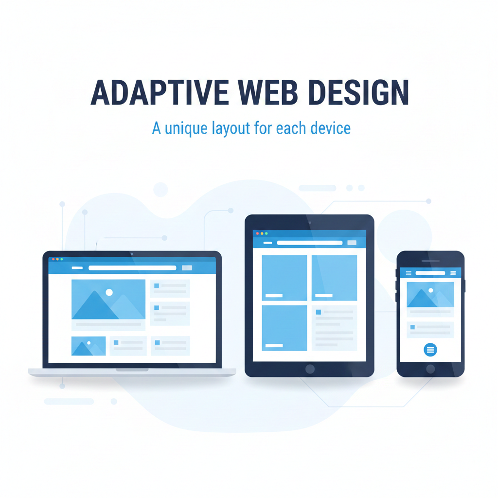
Adaptive Web Design Solutions
Adaptive Web Design (AWD) ensures your website automatically adjusts its layout and elements based on the user’s device and screen size. Unlike responsive design, adaptive websites load pre-designed layouts for specific screen widths, ensuring optimal performance and user experience across desktops, tablets, and mobiles. Our development team delivers adaptive solutions that enhance usability, speed, and brand consistency for all devices.
-
Multi-Device Layouts
-
Optimized for All Screen Sizes
-
Faster Loading & Performance
-
Device-Specific Experience
-
Modular & Scalable Framework
-
SEO & Accessibility Friendly
Tools & Frameworks
Technologies We Use for Adaptive Design
HTML5 & CSS3 – Flexible Layout Structures
Bootstrap & Tailwind – Adaptive Frameworks
React.js & Next.js – Dynamic Front-End Rendering
Media Queries & Fluid Grids – Device Adaptation
Common Questions
Adaptive Web Design FAQ
What is Adaptive Web Design?
Adaptive Web Design involves creating multiple fixed layouts
tailored for
different devices, automatically displaying the most suitable one
for the user’s
screen.
How does it differ from Responsive Design?
While responsive design adjusts fluidly across screens, adaptive
design uses
specific pre-set layouts for devices like phones, tablets, and
desktops for
better control and performance.
Do you provide adaptive web design in Pudukkottai & Trichy?
Yes, our team specializes in building adaptive websites for
businesses in
Pudukkottai and Trichy — ensuring optimal design for every screen
and device.