
Pudukkottai & Trichy
What We Offer
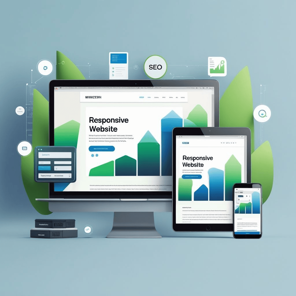
Responsive Web Design Services
Our Responsive Web Design services ensure that your website looks and functions perfectly across all screen sizes and devices — from desktops and tablets to smartphones. We focus on delivering flexible, mobile-first designs that adapt seamlessly, offering your visitors a smooth and engaging browsing experience.
-
Mobile-First Development Approach
-
Flexible Grid & Layout System
-
Adaptive Image & Media Scaling
-
Fast Loading & Optimized Performance
-
SEO-Friendly Responsive Structure
-
Cross-Browser & Cross-Platform Support
Tools & Frameworks
Modern Tools for Responsive Design
Bootstrap – Responsive Layout Framework
Tailwind CSS – Utility-First Design System
React.js – Component-Based Responsive UI
Common Questions
Responsive Design FAQ
What is Responsive Web Design?
Responsive Web Design ensures your website automatically adjusts its
layout and
elements
to provide an optimal viewing experience across all screen sizes and
devices.
Why is it important for my business?
A responsive website improves user experience, reduces bounce rates,
and increases engagement, helping your business reach a broader
audience across
devices.
Do you provide responsive design services in Pudukkottai &
Trichy?
Yes, we offer professional responsive web design services in
Pudukkottai and
Trichy,
ensuring your website is optimized for performance, SEO, and user
experience.